What If
Modernizing a Company with Small Design Changes
Daniel Perez
Keeping track of design trends is a useful tool. This isn’t for the purpose of making sure your designs match what is currently being overused. But to learn when your designs are NOT being used, like at all. You never want to seem like you are an outdated company that doesn’t keep with trends.


What changes were made?
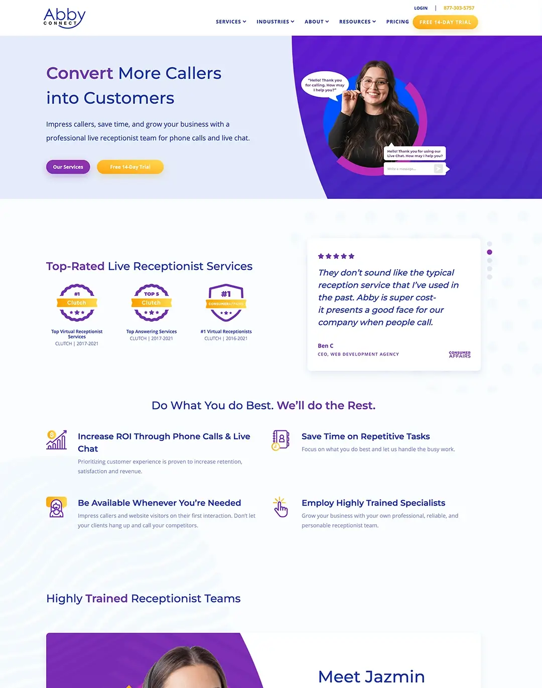
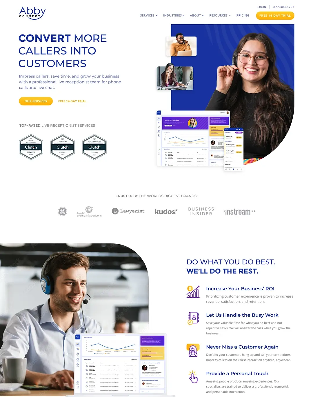
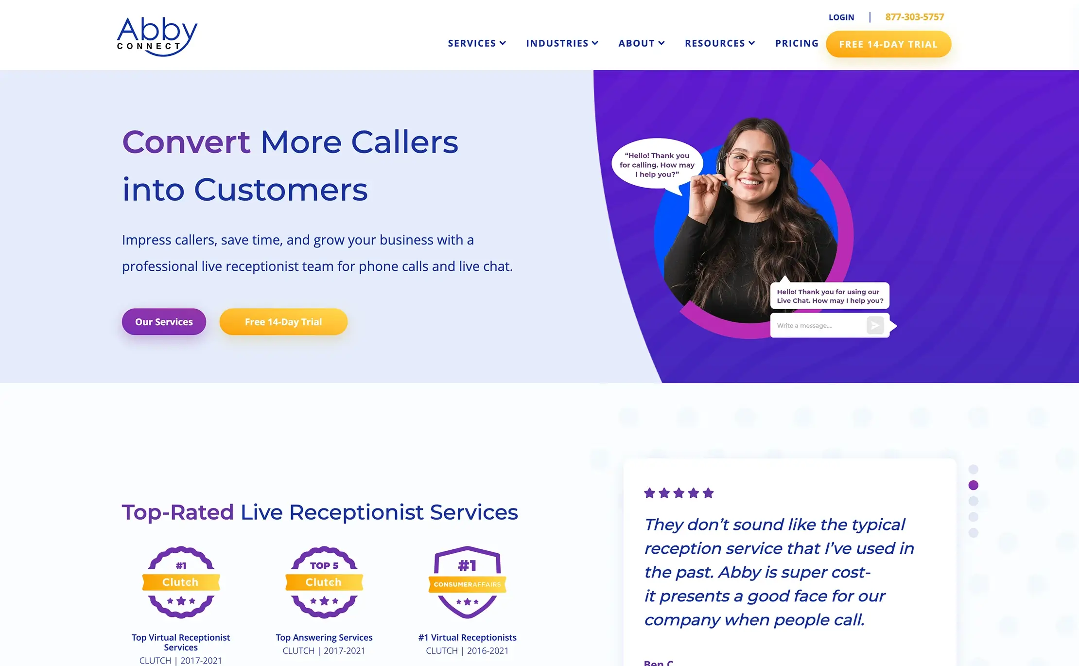
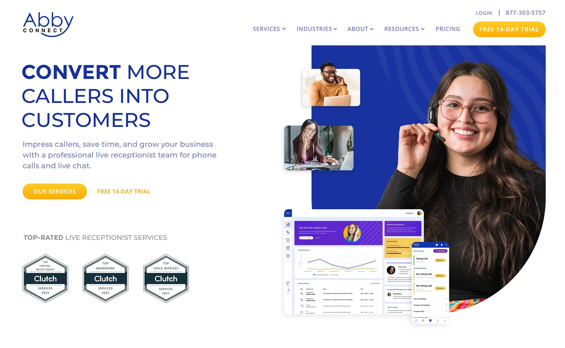
One of the first things we addressed was the lack of white space. White space will allow for content to breathe and not overwhelm the user. Then we simplified the buttons removing colored drop shadows. For the hero section we created a story with imagery that encompasses what the company does. The current site was doing a good job at humanizing the product, but we took it a step further by showing the employees in their work environment. Those are just some of the small updates we pitched, while still not doing a complete brand re-work.


Written By: