To Make Sure Your CTAs are Converting: Avoid These Button Design Mistakes
Daniel Perez
Button design may come as an easy, no brainer after thought. But it is a little harder than that.
When it comes to the main objective of your website or app, it is almost always tied to a button that helps the user convert. Thus making the button a very important thing of the design process. These are some tips for new designers venturing into the UX/UI field on how to ensure your buttons convert.
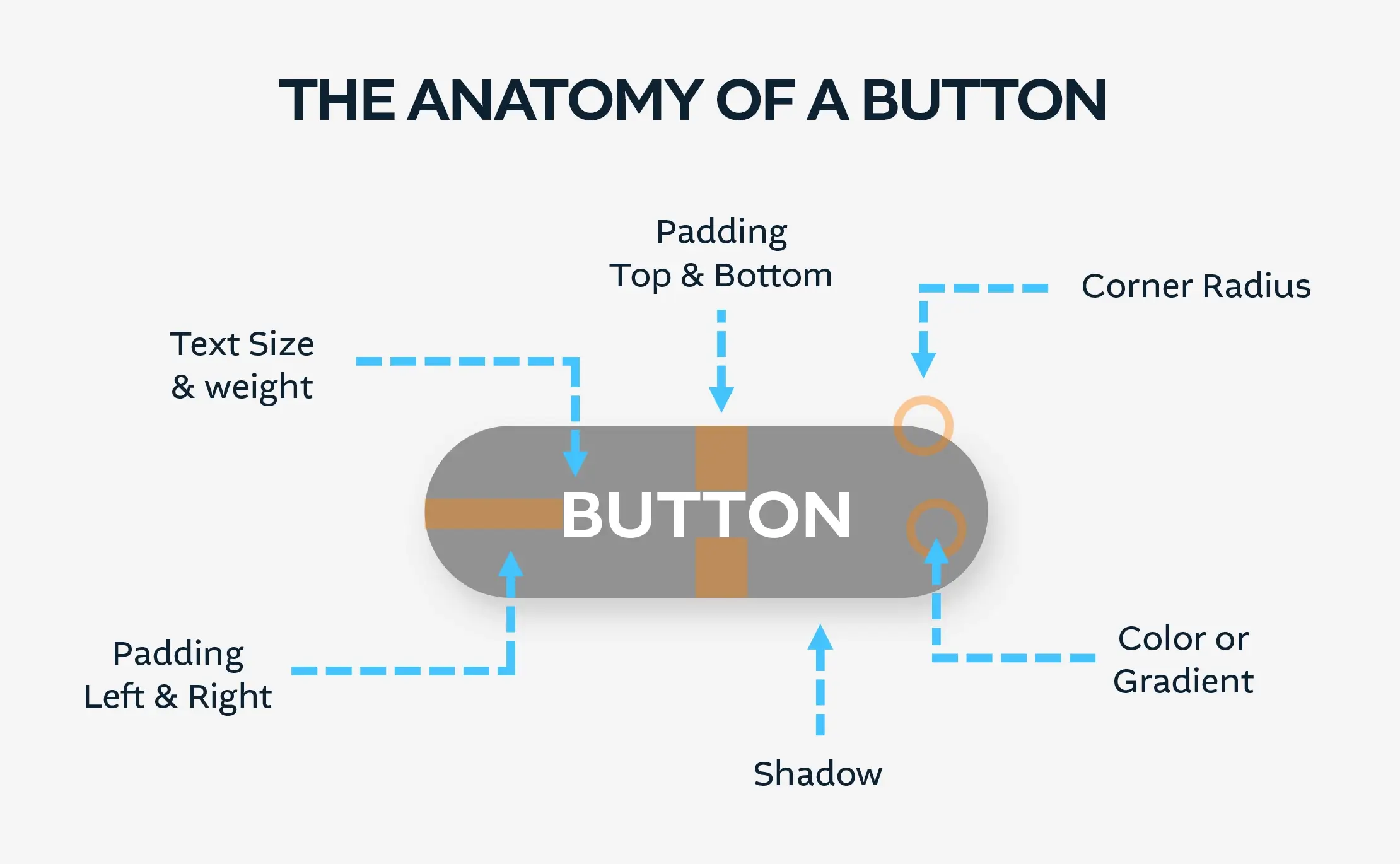
Let’s start with the basics and break down the components of a Button.
Title only
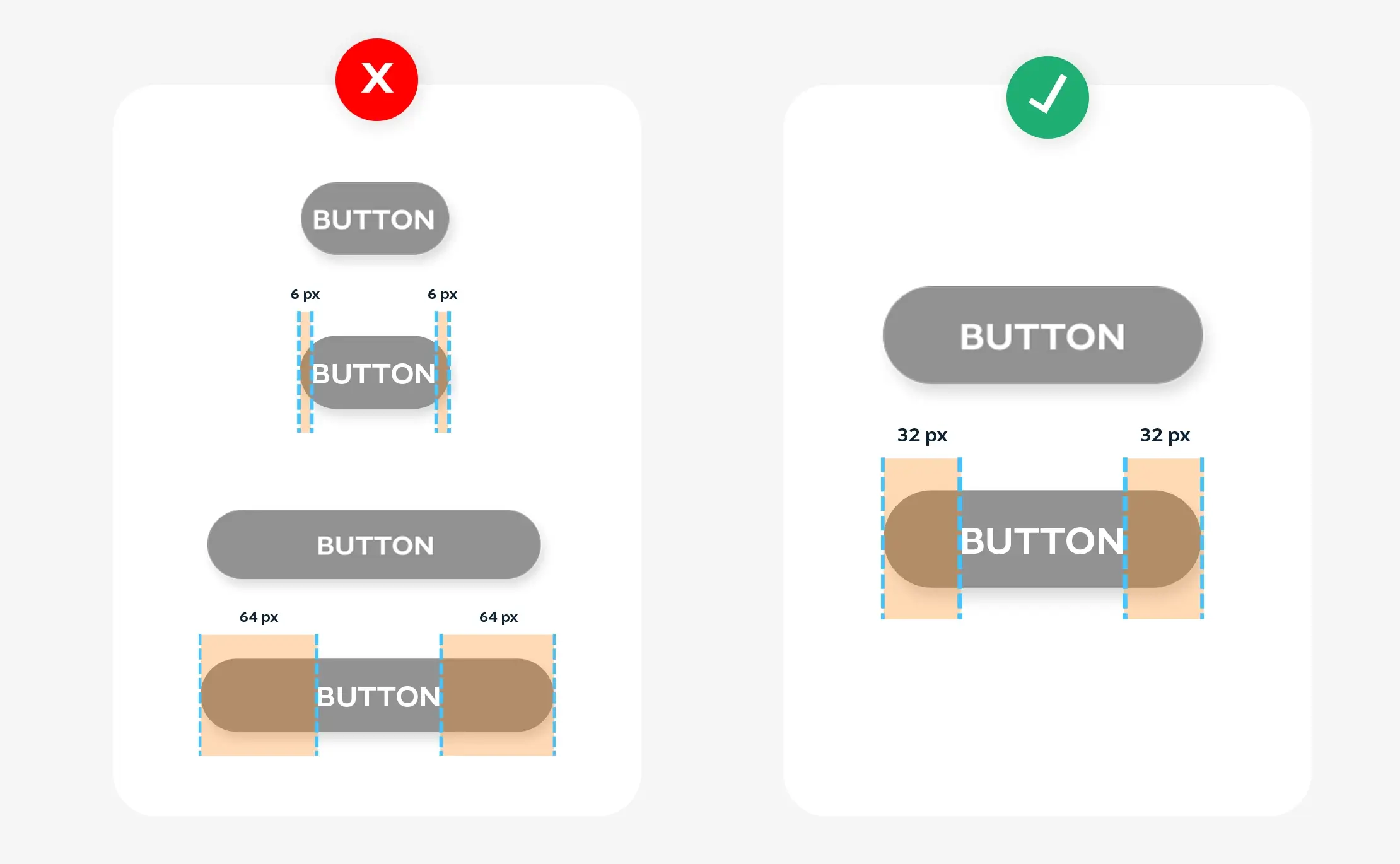
Tip #1 Don’t make the button too narrow or too wide.
A user won’t have the design know how that you do. But they will be turned off or have hesitation on clicking something they haven’t seen before. Typically we make buttons width 32 px when using a font size of 16 px.
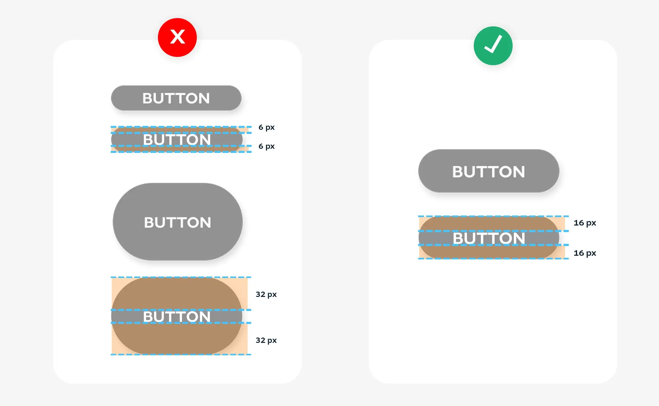
Tip #2 Don’t make the button too high or too low.
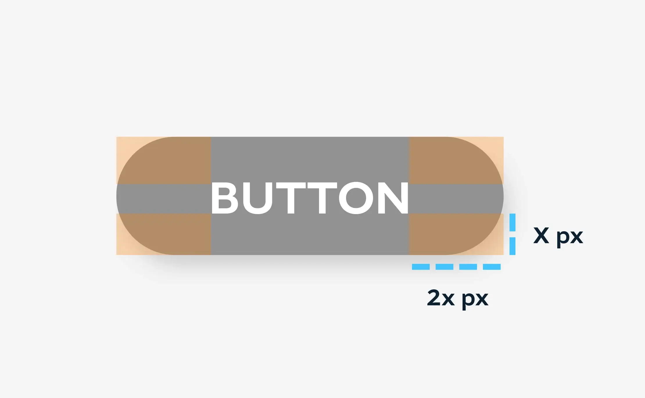
When the bottom space between the text and border is X. You can multiply that by 2 and that outcome will be the padding on right and left of the button text.
This is also a safe and sure formula
When the bottom space between the text and border is X. You can multiply that by 2 and that outcome will be the padding on right and left of the button text.
Tip #3 Don’t try to reinvent the wheel.
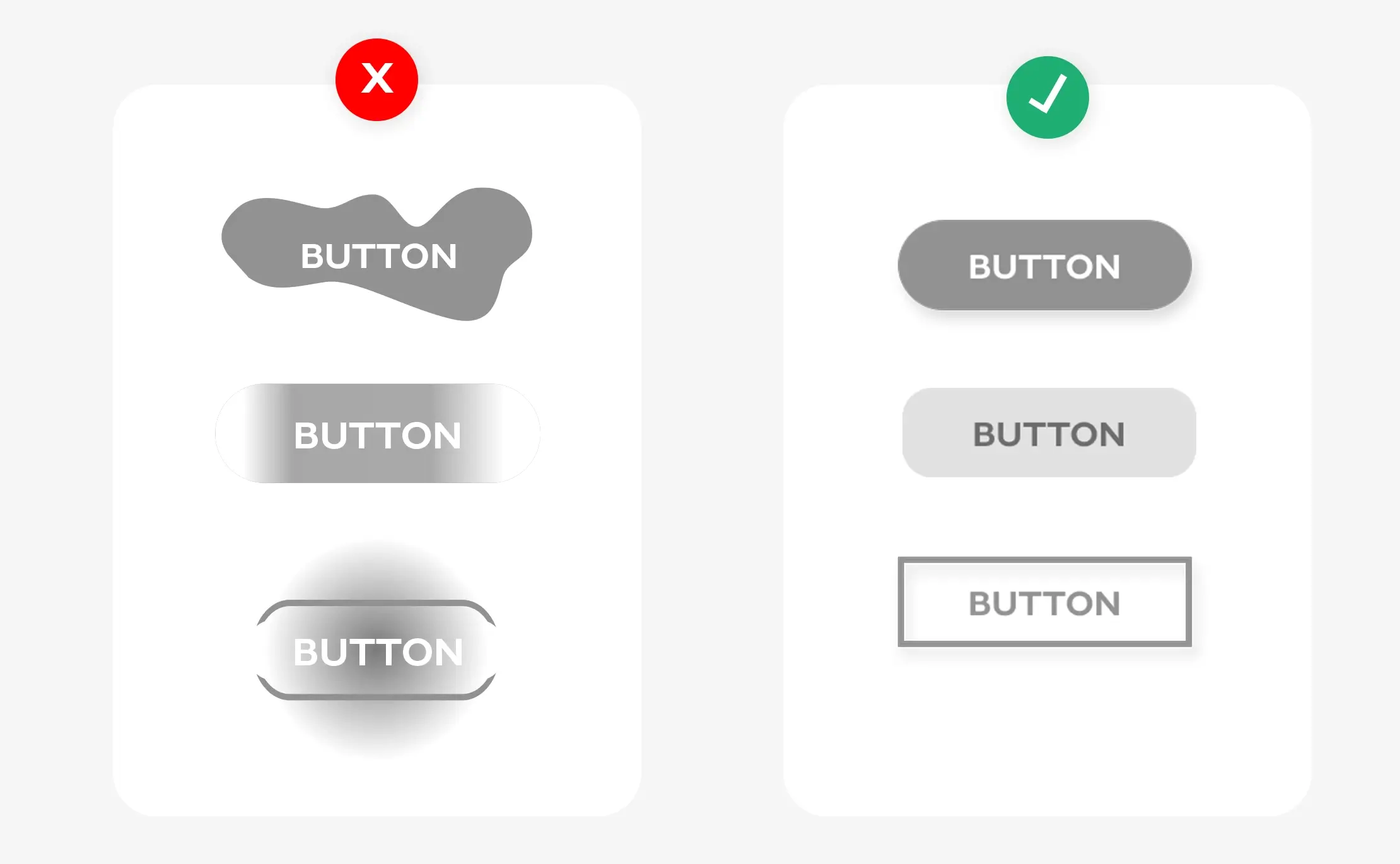
The goal with conversion is to not make the user hesitate or second guess their decisions. That is normally why we use common UX laws and practices. If you try to break away from that mold for usually the sake of creativity, you will hurt your conversion rate due to confusion. Hick’s law states that The time it takes to make a decision increases with the number and complexity of choices.
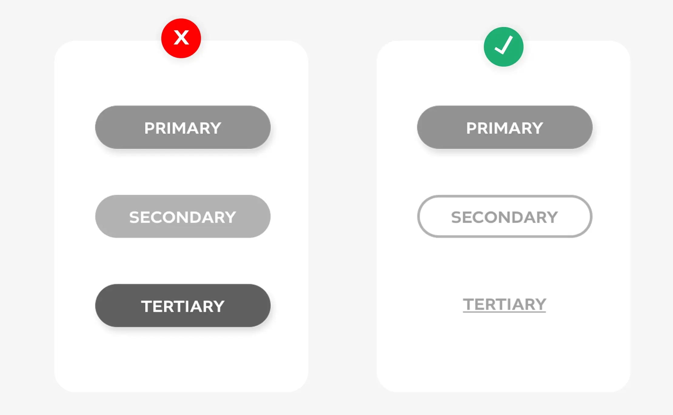
Tip #4 Hierarchy is key to the flow of information.
You don’t want all your buttons to have the same level of importance. As usually there is one conversion goal. That should always be your stand out, popping, eye-catching button. Then you should create a secondary button and treachery button for other conversion goals the stake holder may want. Goal is always to guide the user to the primary conversion.
